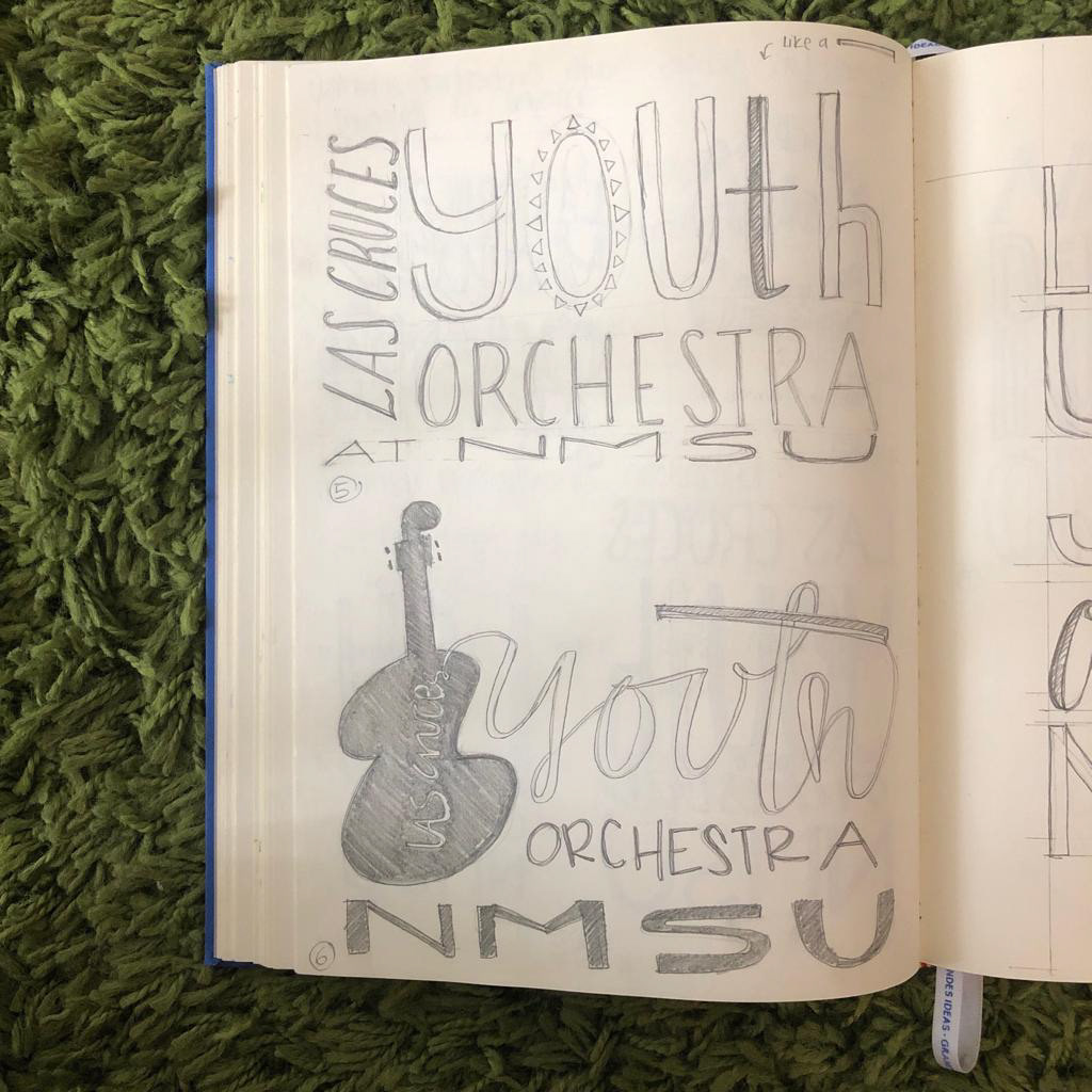
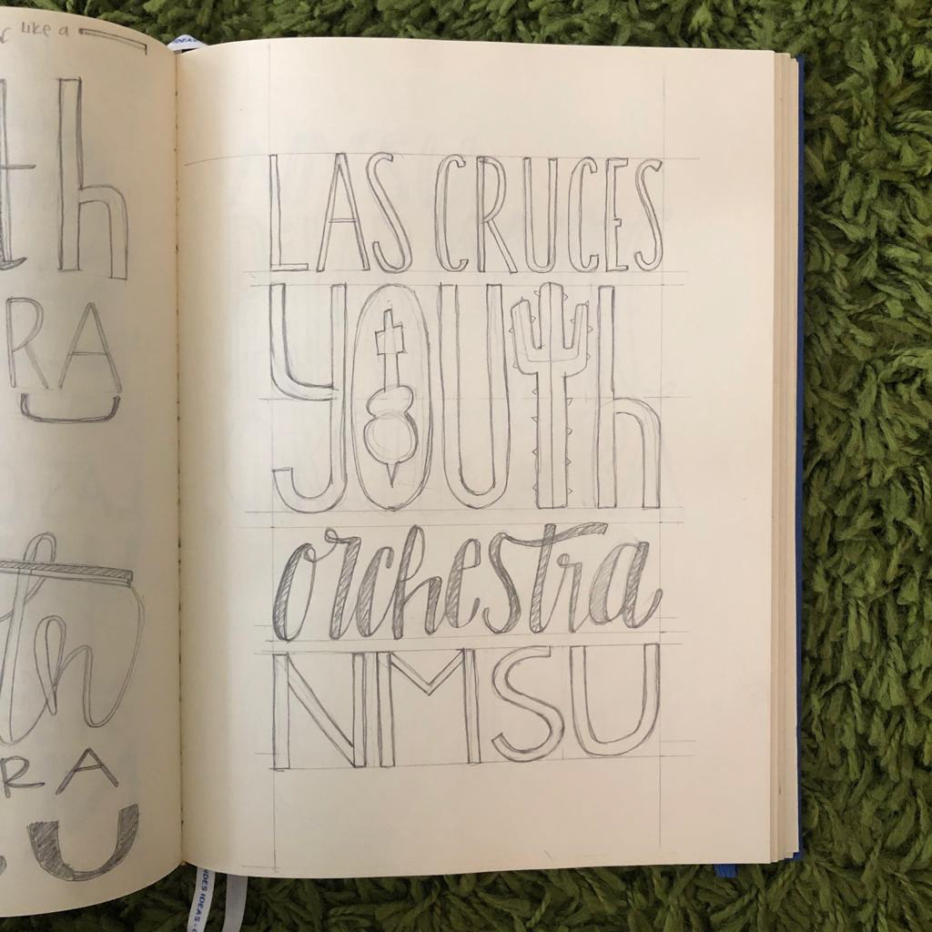
Logo design for "Las Cruces Youth Orchestra". The idea was to start with the NMSU colors and diverge into a more fun and youthful palette.
I also played around with the typography to create a logo that would appeal to the audience that became part of the orchestra. Below find the final design and some of the sketches created in the process.


- Thank You! -


